On this page
Microscape
Microscape scale
Scale hierarchy, prop sizing, foreground/midground/background allocation, common proportion mistakes and corrections.
What is scale
The core appeal of microscapes lies in "seeing the large within the small"—using limited container space to evoke vast landscapes. This visual illusion relies on scale: through prop sizing, layering, and visual guidance, the viewer's brain automatically completes the picture, perceiving a few centimeters of rock as a mountain, a clump of white cushion moss as a forest.
Scale ≠ true proportions: Microscapes are not scaled-down diorama models—if you strictly shrink real landscapes at 1:100, the textures of rocks, plants, and water will feel "off." Microscape scale is an artistic exaggeration: foreground props can be slightly larger (occupying 1/3 of view to create depth), background props can be smaller (receding to distance to stretch space), midground connects them. This "unrealistic" proportion better matches human eye perspective habits.
Why does scale matter? Poor proportions break immersion—oversized props make the scape feel cramped and oppressive (like "toy clutter"), undersized props make it feel empty and unfocused (like "wasteland"). Good scale lets viewers forget container boundaries, focus on the scape itself, and conjure "wilderness immersion."
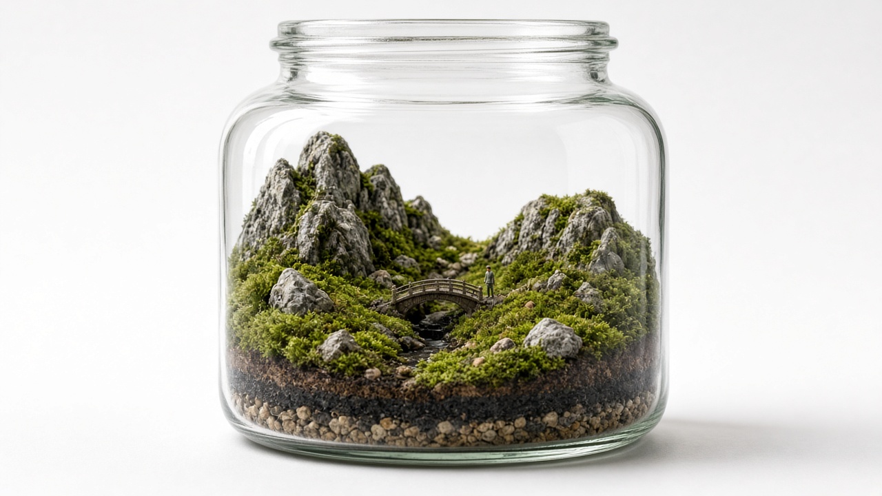
Scale hierarchy: large, medium, small
Microscape scale builds on three-tier hierarchy: large framework (sets tone), medium focal points (draws eyes), small accents (details). All three are essential—only large rocks feel monotonous, only pebbles feel cluttered, only medium props feel flat.
Large framework (50–70% of scape height)
Purpose: Define scape theme and spatial structure. For example, a tall seiryu stone suggests "mountain range," a horizontal driftwood piece suggests "fallen log," a group of upright lava rocks suggests "cliff face."
Sizing:
- Small containers (15–25 cm diameter): Large framework 5–8 cm tall. E.g., 20 cm glass jar with 6 cm seiryu stone as main peak.
- Medium containers (30–50 cm diameter): Large framework 10–15 cm tall. E.g., 40 cm tank with 12 cm driftwood as background.
- Large containers (60 cm+ diameter): Large framework 20–30 cm tall. E.g., 80 cm aquascape with 25 cm lava rock cluster as main feature.
Placement principles: Avoid center—offset 1/3 left or right follows "golden ratio" composition; avoid symmetry—natural rocks rarely mirror perfectly, asymmetry feels more authentic.
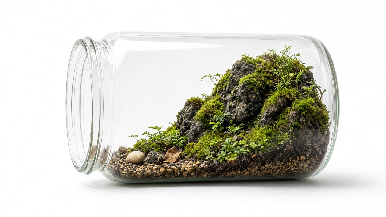
Medium focal points (30–50% of scape height)
Purpose: Visual focus, bridging large framework and small accents. For example, secondary peak (medium rock) at foot of main peak (large rock), mushroom rock (medium) beside fallen log (large), shrub cluster (medium Selaginella) before cliff (large).
Sizing:
- Small containers: Medium props 3–5 cm. E.g., 4 cm rock as secondary peak with 6 cm main peak.
- Medium containers: Medium props 6–10 cm. E.g., 8 cm turtle rock as mushroom with 12 cm driftwood.
- Large containers: Medium props 12–18 cm. E.g., 15 cm lava rock as secondary peak with 25 cm main peak.
Quantity principle: 1–3 pieces—more will steal main scape's spotlight. Scatter them, don't cluster.
Small accents (10–20% of scape height)
Purpose: Fill gaps, add detail layers, create "natural scatter" casualness. For example, pebbles as paths, tiny wood chips as fallen leaves, miniature ceramic figures as scale references.
Sizing:
- All containers: Small props 0.5–2 cm. E.g., 1 cm pebbles, 1.5 cm ceramic mushrooms, 2 cm small wood bits.
Placement principles: Scatter distribution, avoid even spacing (too orderly feels artificial); place a few in foreground, midground, and background to enhance depth.
Prop sizes vs container
Prop sizes must match container dimensions—too large for small containers "won't fit," too small for large containers feel "empty." Below are empirical formulas:
Size formula (framework rocks / driftwood)
Large framework height ≈ container height × 0.6–0.8. Examples:
- 20 cm tall tank → framework 12–16 cm (6–8 cm above substrate).
- 30 cm tall tank → framework 18–24 cm (9–12 cm above substrate).
- 50 cm tall tank → framework 30–40 cm (15–20 cm above substrate).
Why not reach the top? Ceiling-touching props make eyes "stuck" at container edge, breaking depth illusion. Leave 20–40% overhead space so viewer's gaze can "pass through" props, extending to the virtual distance.
Width vs container width
Large framework width ≈ container width × 0.3–0.5. Examples:
- 30 cm wide tank → framework width 9–15 cm (occupying 1/3 to 1/2 floor area).
- 60 cm wide tank → framework width 18–30 cm.
Why not exceed 50%? Over-half width squeezes plant growing space and makes scape feel "blocked." Leave enough empty space for eyes to "flow."
Prop density: spacing balance
Floor coverage principle: Hardscape (rocks + wood) occupies 40–60% floor area, leaving 40–60% for plants and voids.
Density distribution: Don't spread evenly—one side dense (main area), other side sparse (negative space), stronger contrast.
Counter-example: Entire floor covered with pebbles (no voids) → scape feels "full" and "stuffy," lacking breathing room.
Foreground, midground, background
Microscape depth comes from three-layer spatial allocation: foreground (near, large and sharp), midground (middle, transition), background (far, small and soft). This layering mimics human eye perspective—near is large, far is small; near is sharp, far is blurred.
Foreground (front 1/3 of container depth)
Purpose: Establish reference frame, letting viewers quickly judge "how large is this scene."
Prop choices:
- Can be slightly larger: Foreground props can occupy 20–30% scape height (1.5–2× larger than background), creating "distance sensation." E.g., foreground uses 3 cm pebbles, background uses 1.5 cm gravel.
- Color contrast: Foreground uses dark rocks (seiryu, lava) or dark green plants (mini Bolbitis), background uses light rocks or light green moss (white cushion), stronger contrast.
- Leave voids: Don't fill foreground—leave 1/3 empty (fine sand or bare soil), eyes can "enter" the scape interior.
Midground (middle 1/3 of container depth)
Purpose: Visual focal area, where main feature resides.
Prop choices:
- Large framework: Main peak, main wood placed in midground-back position (not dead center), gaze has "pursuing" dynamic feel.
- Plant pairing: Midground plants medium height (Selaginella, small Fittonia), not blocking framework, not "empty."
Background (rear 1/3 of container depth)
Purpose: Create "distance," stretch spatial depth.
Prop choices:
- Small and dense: Background rocks smaller than foreground (0.5–1 cm gravel), densely laid to mimic "rolling distant mountains."
- Blur treatment: Background plants use fine-leaf, low varieties (sheet moss carpet), or light substrate (white sand) to brighten, creating "misty distance" effect.
Common proportion mistakes
Even with beautiful props, poor proportions make scapes "look awkward." Below are common beginner proportion errors and corrections:
1. Props too large: scape crowded
Symptoms:
- One rock fills entire container floor, plants have nowhere to grow.
- Driftwood top touches lid, gaze "blocked."
- Scape looks like "toy clutter," lacking natural feel.
Causes:
- Container too small, or props too large.
- No reserved plant growing space.
Corrections:
- Switch to larger container, or smaller props.
- Hardscape floor coverage not exceeding 60%.
- Framework height not exceeding 80% container height.
2. Props too small: scape hollow
Symptoms:
- Large container, but all props are pebbles, scape feels "barren."
- Lacks visual focal point, nowhere to look.
- Scape resembles "construction site sand pile," not landscape.
Causes:
- Container too large, or props too small.
- Missing large framework as "anchor."
Corrections:
- Add large rock or wood as main feature (occupying 50–70% height).
- If unwilling to add large props, switch to smaller container.
- Small pebbles only as accents, not main actors.
3. Uniform sizing: lacks layers
Symptoms:
- All rocks similar size (all 3–5 cm), scape feels "flat."
- No front-back layers, like "flat collage" not 3D landscape.
Causes:
- No three-tier scale hierarchy established.
Corrections:
- Use at least 3 sizes: large (6–10 cm), medium (3–5 cm), small (1–2 cm).
- Large rocks in mid-background, medium in mid-foreground, small scattered everywhere.
4. Symmetric arrangement: too orderly
Symptoms:
- Two rocks symmetrically placed on tank sides, like "door guardians."
- Plants evenly spaced, like "military parade."
- Scape feels strongly "artificial," lacking natural wildness.
Causes:
- Pursuing symmetrical beauty, ignoring nature's irregularity.
Corrections:
- Main feature offset left or right (golden ratio 1/3 position).
- Secondary features scattered around main, not mirrored symmetrically.
- Plants not evenly spaced—density variation, clustered distribution.
5. Foreground too full: no entry feeling
Symptoms:
- Foreground filled with pebbles or dense plants, gaze "can't enter."
- Scape like "wall," lacking invitation.
Causes:
- Insufficient foreground negative space.
Corrections:
- Leave at least 1/3 foreground void (fine sand, bare soil, or thin sheet moss layer).
- Foreground rocks or plants concentrated on left or right side, not blocking horizontally.
The core of scale is three-tier hierarchy + density contrast + front-back depth—large framework sets tone, medium focus draws eyes, small accents add detail. Let viewer's gaze "flow," not get "stuck." To preview different prop arrangements, open the microscape studio to generate reference images.
Further reading: Starting a moss bottle. Other questions? Contact.
2026-10-12